Datepicker

Description
The Datepicker Node renders a visual datepicker to the user. It comes with many configurable options that are listed below.
Automatically Triggered by Question Nodes
The Datepicker is automatically triggered whenever a Question Node with the Date type is used. This means that you will rarely need to explicitly add the Datepicker Node itself.
Properties

Datepicker Title
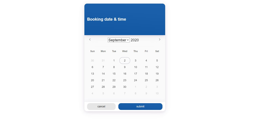
This is the title that will be shown in the header of the datepicker widget (when opened). An example would be: "Booking date & time" (as can be seen in the screenshot above).
Locale
A drop-down menu that lets you select a locale for the Datepicker. This automatically outputs the date format in the localized language.
Mode
Mode determines the behavior of the Datepicker.
- Single: This means that a single date can be selected.
- Multiple: This lets the user select multiple dates.
- Range: This lets the user select a date range.
Button Texts
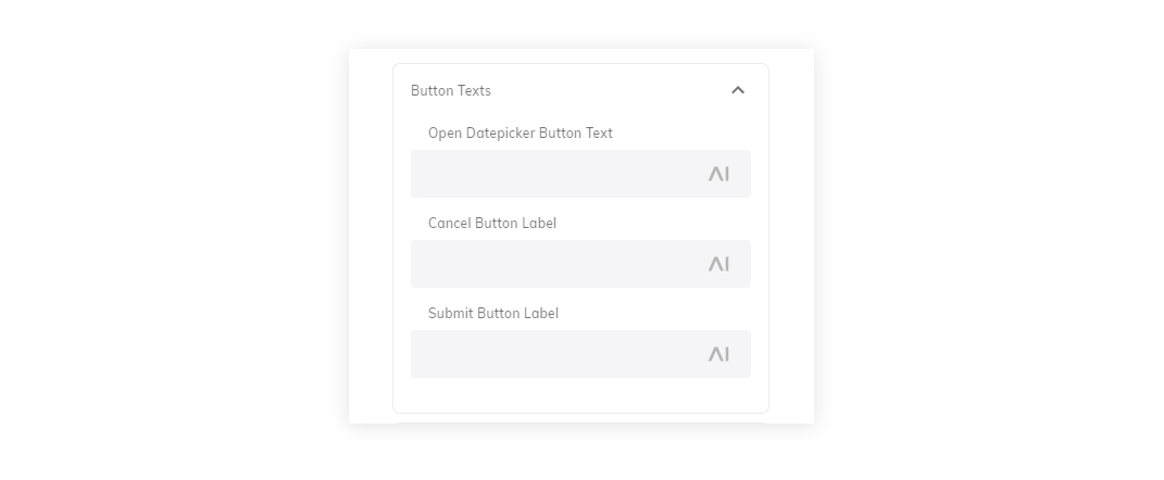
Open Datepicker Button Text
This is the text that is shown in the button that is rendered when the Datepicker is triggered. By default, is says: pick date.
Cancel Button Label
This is the text that is shown on the "cancel" button that is rendered when the Datepicker has been opened. The default is cancel.
Submit Button Label
This is the text that is shown on the "submit" button that is rendered when the Datepicker has been opened. The default is submit.
Date settings
The Datepicker allows you to pricisely configure which dates can be selected.
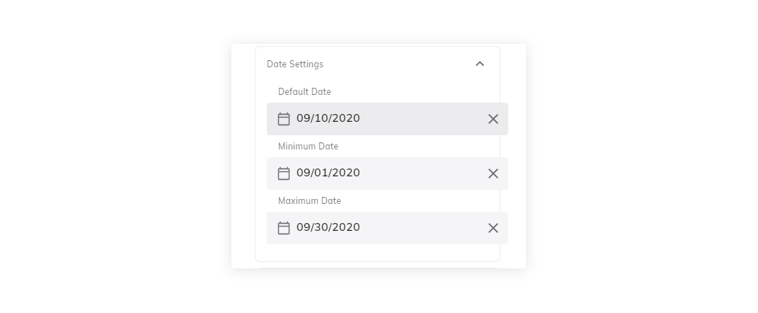
Default Date
This is the default selected date. If not filled out, it will be the current date.
Minimum Date
This is the minimum date. If not filled out, it will not have a minimum date.
Maxium Date
This is the maximum selectable date. If not filled out, it will not have a maximum date.
Time settings
The Datepicker allows you to configure whether times can be selected. If so, it also allows you to configure the default times in detail.
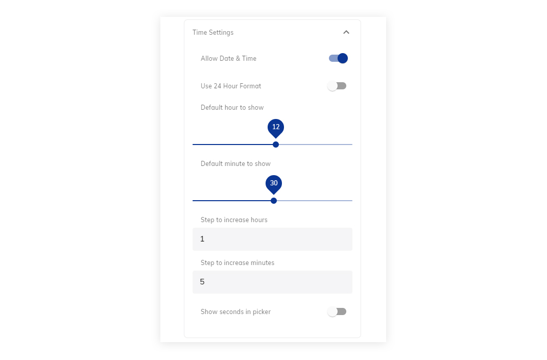
Allow Date & Time
Determines whether the Datepicker should additionally show selectable time.
Use 24-Hour Format
If selected, the Datepicker will display times in 24-hour format (for example, 20:00h instead of 8:00PM).
Default Hour to show
Configurable default hour.
Default minute to show
Configurable default minute.
Step to increase hours
The increment step size for hours. The default is 1 hour.
Step to increase minutes
The incremental increase in minutes, when the minute selection is used. The default is 5 minutes.
Show seconds in picker
Enable this setting to show seconds in the Datepicker options.
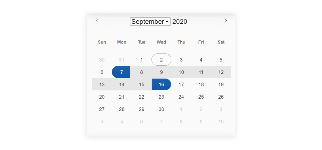
Enable/Disable Dates
The Datepicker can be configured to exclude (or include) specific dates. This is useful in use cases where specific dates should be unavailable - for example, a booking or reservation bot.

Enable specific dates
This setting allows you to enter a range of dates that should be enabled. If configured, all other dates will automatically be disabled. In addition, you can define a function that is used to enable dates - for example only weekdays.
Enable dates by function - example:
(date: Date): boolean => {
    /* The function takes in a Date object, and should return a boolean value.
    * If the function returns true, the date will be enabled.
    * Sunday = 0, Monday = 1, Tuesday = 2, Wednesday = 3, Thursday = 4, Friday = 5, Saturday = 6
    */
    // This will enable Monday to Friday
    return (date.getDay() > 0 && date.getDay() < 6);
};
Disable specific dates
This setting allows you to enter a range of dates that should be disabled. If configured, all other dates will automatically be enabled. In addition, you can define a function that is used to disable dates - for example every saturday and sunday.
Disable dates by function - example:
(date: Date): boolean => {
    /* The function takes in a Date object, and should return a boolean value.
    * If the function returns true, the date will be disabled.
    * Sunday = 0, Monday = 1, Tuesday = 2, Wednesday = 3, Thursday = 4, Friday = 5, Saturday = 6
    */
    // This will disable every Sunday and Saturday
    return (date.getDay() === 0 || date.getDay() === 6);
};
Advanced Options
The Datepicker comes with four advanced options:

Date Format
This field can be used to output a specific date format, like: "Y-m-d".
Hide Calendar
When enabled, the Datepicker will not display a calendar.
Show week numbers
When enabled, the week numbers are shown in the calendar.
Hide Datepicker Quick Reply
This hides the quick reply in the Datepicker.