

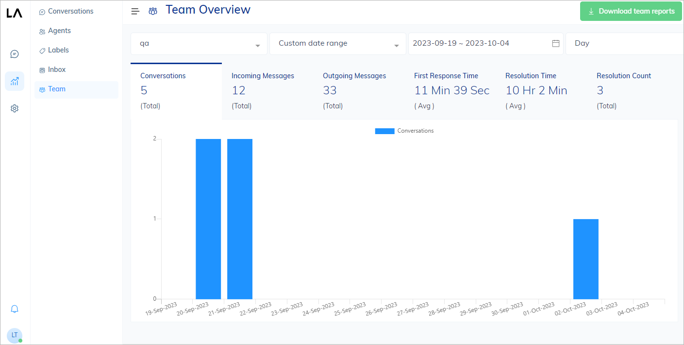
Combined Charts
The combined chart includes the following charts:- Indicator. Represents a total or an average number. When there is a significant increase or decrease in conversation handling based on the last entry, it will be displayed next to the indicator value with a percentage figure related to the calculated average value of the selected time period. Increasing trends will be indicated with a plus and a green colored figure, and decreasing trends will be indicated with a minus in red color. For conversations, an increasing number means you have got more customer messages. For solving problems, increasing number, for example,
+25%, means you got better at solving customer issues or got easier conversations. - Bar chart. The horizontal axis typically represents dates or time periods, illustrating how the metrics change over time, while the vertical axis represents various performance metrics such as the number of messages or conversations.
Report Metrics
Each report includes charts with the following metrics:| Metric | Description |
|---|---|
| Conversations | The number of conversations that occurred during the selected period. |
| Incoming Messages | The number of incoming messages sent by end users that occurred during the selected period. This metric is not applicable to the Agents report. |
| Outgoing Messages | The number of outgoing messages sent by human agents that occurred during the selected period. |
| First Response Time | The time period for the first reply of a human agent to the end user across all conversations. |
| Resolution Time | The amount of time it takes to resolve a conversation. The data for this metric is collected from all conversations, providing an overall picture of how long it takes to handle and complete customer interactions. |
| Resolution Count | The number of conversations that are resolved by human agents in the selected period. |