

Updated in 2025.20Documentation Index
Fetch the complete documentation index at: https://docs.cognigy.com/llms.txt
Use this file to discover all available pages before exploring further.
Description
The Say Node sends a message to the user. This message can have different formats, ranging from a simple text to rich media such as galleries, adaptive cards, videos, and audio. Additionally, you can enhance the existing output with Generative AI and control who can receive messages when the conversation is handed over to a contact center.Parameters
Channels
Depending on the current channel, additional rich media formats are available. Add a new channel output by clicking the icon and selecting the channel that corresponds to the Endpoint that is deployed.
Refer to the available channels.
icon and selecting the channel that corresponds to the Endpoint that is deployed.
Refer to the available channels.
Default Cognigy.AI Channel
The default Cognigy.AI channel allows for the configuration of different output types. Not all Endpoints can correctly convert your content to the desired output type. Before configuration, check the compatibility of the output type with the Endpoint.Output Type
Text
Text
The Text output type renders text and emojis, if supported by the channel. The text field also supports CognigyScript and Tokens that can be added by clicking  at the end of each field.
OptionsWhen you send text responses, you can control how the text is delivered and attach additional data to the message.
When configuring the Linear and Loop parameters, the message delivery behavior differs:
at the end of each field.| Parameters | Type | Description |
|---|---|---|
| Text | CognigyScript | The message you want the AI Agent to send. If you want to customize the text by adding italic or bold styles or including links, only HTML is supported. You can add multiple text messages — one message per field. Enter the first message and press Enter to add additional messages. When multiple text messages are added, the delivery order is controlled by the Linear and Loop parameters available in the Options section. Only one message is delivered with each Node execution. If you want the AI Agent to send two or more messages at once, add a new Say Node. |
| Parameter | Type | Description |
|---|---|---|
| Linear | Toggle | Controls whether the text responses are shown in a specific order (linearly) or randomly. If enabled, the text options are presented one after the other in the defined sequence. |
| Loop | Toggle | Works in conjunction with the Linear option. If Linear and Loop are enabled, the sequence starts over from the beginning after reaching the end. If Loop is disabled, the last text option will keep repeating after reaching the end. |
| Data | JSON | Allows you to include additional data that you want to send along with the message to the client. For example, { "type": "motivational" }. |
| Behavior | Configuration | Example Conversation |
|---|---|---|
| Random Behavior | Linear: Off Loop: Off | User: Give me some motivation.AI Agent: You are doing great!User: Another one, please.AI Agent: Believe in yourself!User: More motivation.AI Agent: Keep pushing forward!Responses are in random order each time. |
| Linear + Non-looping | Linear: On Loop: Off | User: Give me some motivation.AI Agent: Keep pushing forward!User: Another one, please.AI Agent: Believe in yourself!User: More motivation.AI Agent: You are doing great!User: One more, please.AI Agent: You are doing great! (repeats last message)Responses follow a fixed sequence and repeat the last message after reaching the end. |
| Linear + Looping | Linear: On Loop: On | User: Give me some motivation.AI Agent: Keep pushing forward!User: Another one, please.AI Agent: Believe in yourself!User: More motivation.AI Agent: You are doing great!User: Next!AI Agent: Keep pushing forward! (starts sequence over)Responses cycle through in a fixed order and restart from the beginning after reaching the end. |
Text with Quick Replies
Text with Quick Replies
The Text with Quick Replies output type can be used to show the user a number of configurable quick replies.
Quick replies are pre-defined answers that are rendered as input chips.
| Parameters | Type | Description |
|---|---|---|
| Text | CognigyScript | The message you want the AI Agent to send. If you want to customize the text by adding italic or bold styles or including links, note that Markdown isn’t supported; only HTML is allowed. |
| Add Quick Reply | Button | Adds a new Empty Quick Reply button. You can add multiple buttons. |
| Empty Quick Reply | Button | Adds a new Quick Reply button. |
| Button Title | CognigyScript | Appears only when the Empty Quick Reply parameter is selected. The title of the button. |
| Select Button Type | Dropdown | You can select the following options:
|
| Postback Value | CognigyScript | Appears if the Post back value in Select Button Type is selected. The value that is sent to the start of the Flow, simulating user input as if the user had manually typed it. |
| Phone number | CognigyScript | Appears if the Phone number value in Select Button Type is selected. The number must be formatted as a valid phone number and shouldn’t contain spaces or special characters. |
| Intent name | CognigyScript | Appears if the Trigger Intent value in Select Button Type is selected. The Intent name that should be triggered. |
| Image URL | CognigyScript | The URL for the image. Note that if you upload a URL to a storage service, such as Google Cloud Storage or AWS, the URL should be publicly accessible. |
| Image Alternate Text | CognigyScript | The alternative text for accessibility, which describes the image for users who cannot see it. |
| Condition: Cognigy Script | CognigyScript | Allows control over when buttons are shown or hidden based on conditions written in CognigyScript. If you’re displaying buttons in a card and only want to show one when there’s data, use this condition {{context.array.length > 0}}. It checks if the array has items (length is greater than 0). If true, the button will appear; if false, it stays hidden. |
| Textual Description | CognigyScript | The text that appears if the buttons aren’t rendered in the chat. This text can also serve as context, meaning it is included in the transcript or prompt, allowing AI Agents to provide more accurate responses. If you activate the Include Rich Media Context parameter in Get Transcript, AI Agent, or LLM Prompt Nodes, the context will be taken only from the Textual Description parameter. If the Textual Description parameter is empty, the context will instead be taken from the button titles in Text with Quick Replies. |
Gallery
Gallery
The Gallery output type consists of powerful visual widgets that are ideal for displaying a list of options with images. They are typically used to showcase a variety of products or other items that can be browsed.A gallery can be configured with multiple cards. Each card contains an image, a title, and a subtitle, and can be configured with optional buttons.Card
Button
| Parameters | Type | Description |
|---|---|---|
| Add Card | Button | Adds a new card for the Gallery type. You can add multiple cards. |
| Add Image | Button | Adds an image for the selected card. |
| Image URL | Button | Appears when the Add Image parameter is selected. The URL for the image. Note that if you upload a URL to a storage service, such as Google Cloud Storage or AWS, the URL should be publicly accessible. |
| Image Alternate Text | CognigyScript | Appears when the Add Image parameter is selected. The alternative text for accessibility, which describes the image for users who cannot see it. |
| Title | CognigyScript | Appears when the Add Card parameter is selected. The title of the card. |
| Subtitle | CognigyScript | Appears when the Add Card parameter is selected. The subtitle of the card. |
| Condition: Cognigy Script | CognigyScript | Allows you to control when cards are shown or hidden based on conditions written in CognigyScript. If you’re displaying cards in a Gallery and only want to show a card when there’s data, use this condition: {{context.array.length > 0}}. It checks if the array has items (length is greater than 0). If true, the card will appear; if false, it stays hidden. |
| Textual Description | CognigyScript | The text that will appear if the cards aren’t rendered in the chat. This text can also serve as context, meaning it is included in the transcript or prompt, allowing AI Agents to provide more accurate responses. If you activate the Include Rich Media Context parameter in Get Transcript, AI Agent, or LLM Prompt Nodes, the context will be taken only from the Textual Description parameter. If the Textual Description parameter is empty, the context will instead be taken from the image alt text, button titles, and subtitles in Gallery. |
| Parameters | Type | Description |
|---|---|---|
| Add Button | Button | Adds a new Empty Title button. You can add multiple buttons. |
| Empty Title | Button | Adds a new button to the selected card. |
| Button Title | Button | Appears only when the Empty Title parameter is selected. The title of the button. |
| Select Button Type | Dropdown | You can select the following options:
|
| Postback Value | CognigyScript | Appears if the Post back value in Select Button Type is selected. The value that is sent to the start of the Flow, simulating user input as if the user had manually typed it. |
| URL | CognigyScript | Appears if the URL value in Select Button Type is selected. The URL must start with http:// or https://, be a valid, publicly accessible address, and contain no spaces or unsafe characters. |
| URL Target | CognigyScript | Appears if the URL value is selected in the Select Button Type. You can select one of the following options:
|
| Phone number | CognigyScript | Appears if the Phone number value in Select Button Type is selected. The number must be formatted as a valid phone number and shouldcontain spaces or special characters. |
| Intent name | CognigyScript | Appears if the Trigger Intent value in Select Button Type is selected. The Intent name that should be triggered. |
| Condition: Cognigy Script | CognigyScript | Allows control over when buttons are shown or hidden based on conditions written in CognigyScript. If you’re displaying buttons in a card and only want to show one when there’s data, use this condition {{context.array.length > 0}}. It checks if the array has items (length is greater than 0). If true, the button will appear; if false, it stays hidden. |
Text with Buttons
Text with Buttons
List
List
The List output type allows a customized list of items to be displayed, with many configuration options such as a header image, buttons, images, and more.The first list item can optionally be converted into a header that includes the list title, subtitle, and button. Each additional list item can have a title, subtitle, image, and button. A button can also be added at the bottom of the list.Item
Item ButtonEach item can have a separate button.
To configure it, hover the mouse over the Empty Title and click + icon.
You can add only one button per item.
ButtonYou can add only one button at the bottom of the list.
| Parameters | Type | Description |
|---|---|---|
| Add item | Button | Adds a new Empty Title button to the selected card. You can add up to 10 items. |
| Empty Title | Button | Adds a new entry to the list. |
| Title | CognigyScript | Appears when you select Empty Title. |
| Subtitle | CognigyScript | Appears when the Add Card parameter is selected. The subtitle of the card. |
| Image URL | Button | Appears when the Add Image parameter is selected. The URL for the image. Note that if you upload a URL to a storage service, such as Google Cloud Storage or AWS, the URL should be publicly accessible. |
| Image Alternate Text | CognigyScript | Appears when the Add Image parameter is selected. The alternative text for accessibility, which describes the image for users who cannot see it. |
| Default Action URL | CognigyScript | Appears when the Empty Title parameter is selected. It is a link that opens when the user clicks anywhere on the item. It’s used when you want the entire item to be clickable, directing the user to a specific website or resource. |
| Condition | CognigyScript | Allows you to control when items are shown or hidden based on conditions written in CognigyScript. If you’re displaying items in a list and only want to show a list when there’s data, use this condition: {{context.array.length > 0}}. It checks if the array has items (length is greater than 0). If true, the item will appear; if false, it stays hidden. |
| Textual Description | CognigyScript | The text that appears if the item buttons aren’t rendered in the chat. This text can also serve as context, meaning it is included in the transcript or prompt, allowing AI Agents to provide more accurate responses. If you activate the Include Rich Media Context parameter in Get Transcript, AI Agent, or LLM Prompt Nodes, the context will be taken only from the Textual Description parameter. If the Textual Description parameter is empty, the context will instead be taken from the image alt text, button titles, and subtitles in List. |
| Parameters | Type | Description |
|---|---|---|
| Button Title | Button | Appears only when the Empty Title parameter is selected. The title of the button. |
| Select Button Type | Dropdown | You can select the following options:
|
| Postback Value | CognigyScript | Appears if the Post back value in Select Button Type is selected. The value that is sent to the start of the Flow, simulating user input as if the user had manually typed it. |
| URL | CognigyScript | Appears if the URL value in Select Button Type is selected. The URL must start with http:// or https://, be a valid, publicly accessible address, and contain no spaces or unsafe characters. |
| URL Target | CognigyScript | Appears if the URL value is selected in the Select Button Type. You can select one of the following options:
|
| Phone number | CognigyScript | Appears if the Phone number value in Select Button Type is selected. The number must be formatted as a valid phone number and shouldn’t contain spaces or special characters. |
| Intent name | CognigyScript | Appears if the Trigger Intent value in Select Button Type is selected. The Intent name that should be triggered. |
| Condition: Cognigy Script | CognigyScript | Allows control over when buttons are shown or hidden based on conditions written in CognigyScript. If you’re displaying buttons in a card and only want to show one when there’s data, use this condition {{context.array.length > 0}}. It checks if the array has items (length is greater than 0). If true, the button will appear; if false, it stays hidden. |
| Parameters | Type | Description |
|---|---|---|
| Add Button | Button | Adds a new Empty Title button. |
| Empty Title | Button | Opens a configuration menu for the button. Once you configure Button Title, the button is added to the bottom of the list. You can also configure Select Button Type and Condition: Cognigy Script. |
| Button Title | Button | Appears only when the Empty Title parameter is selected. The title of the button. |
| Select Button Type | Dropdown | You can select the following options:
|
| Postback Value | CognigyScript | Appears if the Post back value in Select Button Type is selected. The value that is sent to the start of the Flow, simulating user input as if the user had manually typed it. |
| URL | CognigyScript | Appears if the URL value in Select Button Type is selected. The URL must start with http:// or https://, be a valid, publicly accessible address, and contain no spaces or unsafe characters. |
| URL Target | CognigyScript | Appears if the URL value is selected in the Select Button Type. You can select one of the following options:
|
| Phone number | CognigyScript | Appears if the Phone number value in Select Button Type is selected. The number must be formatted as a valid phone number and shouldn’t contain spaces or special characters. |
| Intent name | CognigyScript | Appears if the Trigger Intent value in Select Button Type is selected. The Intent name that should be triggered. |
| Condition: Cognigy Script | CognigyScript | Allows control over when buttons are shown or hidden based on conditions written in CognigyScript. If you’re displaying buttons in a card and only want to show one when there’s data, use this condition {{context.array.length > 0}}. It checks if the array has items (length is greater than 0). If true, the button will appear; if false, it stays hidden. |
Audio
Audio
The Audio output type plays audio when supported by the channel. It is configured by providing a URL to the audio file and includes controls to play, pause, and stop the audio.
| Parameters | Type | Description |
|---|---|---|
| Audio URL | CognigyScript | The URL of the track you want to play. Note that the URL should be publicly accessible. |
| Audio Alternate Text | CognigyScript | The audio transcript you can add alongside the audio, allowing users to download it. Only applicable to Webchat v3. |
| Textual Description | CognigyScript | The text that appears if the audio content isn’t rendered in the chat. This text can also serve as context, meaning it is included in the transcript or prompt, allowing AI Agents to provide more accurate responses. If you activate the Include Rich Media Context parameter in Get Transcript, AI Agent, or LLM Prompt Nodes, the context will be taken only from the Textual Description parameter. If the Textual Description parameter is empty, the context will instead be taken from the alt text in Audio. |
Image
Image
The Image output type displays an image.
| Parameters | Type | Description |
|---|---|---|
| Image URL | Button | Appears when the Add Image parameter is selected. The URL for the image. Note that if you upload a URL to a storage service, such as Google Cloud Storage or AWS, the URL should be publicly accessible. |
| Image Alternate Text | CognigyScript | Appears when the Add Image parameter is selected. The alternative text for accessibility, which describes the image for users who cannot see it. |
| Textual Description | CognigyScript | The text that appears if the image content isn’t rendered in the chat. This text can also serve as context, meaning it is included in the transcript or prompt, allowing AI Agents to provide more accurate responses. If you activate the Include Rich Media Context parameter in Get Transcript, AI Agent, or LLM Prompt Nodes, the context will be taken only from the Textual Description parameter. If the Textual Description parameter is empty, the context will instead be taken from the alt text in Image. |
Video
Video
The Video output type allows you to add a video clip.
It takes a URL as an input parameter and automatically starts playing the video if supported by the Endpoint.
| Parameters | Type | Description |
|---|---|---|
| Video URL | Button | The URL of the track you want to play. Note that the URL should be publicly accessible. |
| Video Alternate Text | CognigyScript | The video transcript you can add alongside the audio to allow users to download it. This field is applicable only to Webchat v3. |
| Video Captions URL | CognigyScript | A link to a file containing captions for the video. This URL provides text-based descriptions of the audio content, which helps with accessibility and understanding the video. The captions should be in .vtt format. |
| Textual Description | CognigyScript | The text that appears if the video content isn’t rendered in the chat. This text can also serve as context, meaning it is included in the transcript or prompt, allowing AI Agents to provide more accurate responses. If you activate the Include Rich Media Context parameter in Get Transcript, AI Agent, or LLM Prompt Nodes, the context will be taken only from the Textual Description parameter. If the Textual Description parameter is empty, the context will instead be taken from the alt text in Video. |
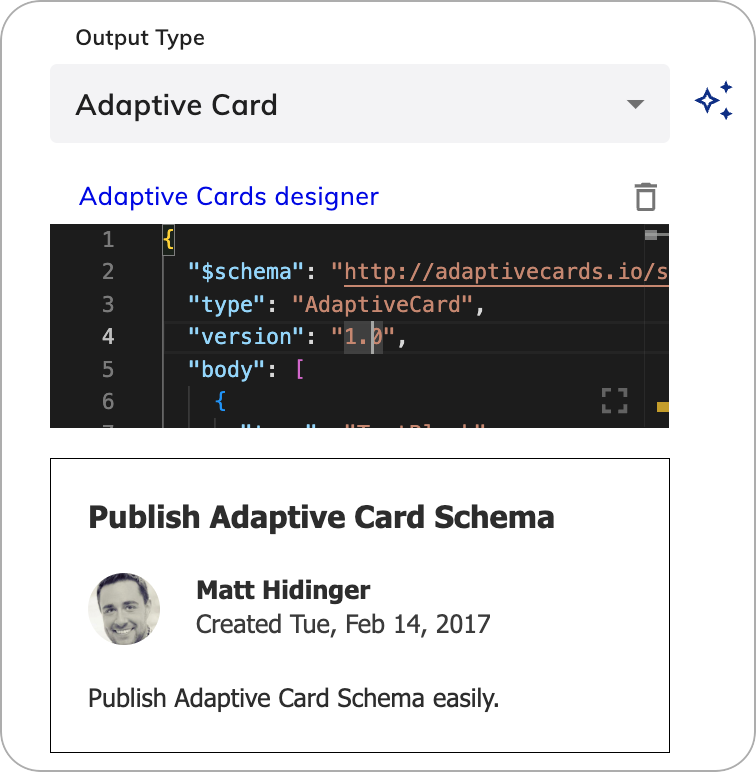
Adaptive Card
Adaptive Card
The Adaptive Card output type allows you
to add Microsoft Adaptive Cards.
They offer customization options, support for rich media (images, video, and audio),
ease of use with a simple JSON schema,
and the ability to create dynamic content for users to match their specific needs and branding.
Create an Adaptive Card with Generative AIYou can also use Generative AI to create a new adaptive card or improve an existing one. Before using it, ensure that you are connected to one of the LLM Providers.To use this feature, follow these steps: and
and  .To replace the current Adaptive Card with a new one, click
  .
.
| Parameters | Type | Description |
|---|---|---|
| Adaptive Card Designer | JSON | The JSON schema that defines the structure and content of the adaptive card. You can create an adaptive card using the Adaptive Card Designer and then copy and paste the JSON code into the editor. Customize the existing JSON as needed, and if the JSON is valid, the adaptive card will be rendered below the editor. Cognigy.AI supports a limited number of Adaptive Card versions. Using the latest versions may cause compatibility issues. Refer to supported versions for best results. |
| Textual Description | CognigyScript | The text that appears if the adaptive card content isn’t rendered in the chat. This text can also serve as context, meaning it is included in the transcript or prompt, allowing AI Agents to provide more accurate responses. If you activate the Include Rich Media Context parameter in Get Transcript, AI Agent, or LLM Prompt Nodes, the context will be taken only from the Textual Description parameter. If the Textual Description parameter is empty, the context will instead be taken from the JSON in Adaptive Card. |
Adaptive Card JSON example
Adaptive Card JSON example
- Select the Adaptive Card output type.
- On the right side of the Output type list, click
 .
.
- In the Generate Node Output section, instruct the Generative AI model how to improve the current adaptive card. For example,
Create a form with a customer name field and a date input field. - Click Generate. The adaptive card will be generated.
- Iteratively improve the resulting adaptive card by giving further instructions in the Generate Node Output section. For example,
Add a flight number field. - Click Generate. The existing adaptive card will be updated.
and .To replace the current Adaptive Card with a new one, click .Generative AI Adaptive Card JSON example
Generative AI Adaptive Card JSON example
AI-Enhanced Output
To use AI-enhanced output rephrasing, read the Generative AI article.Handover Settings
When using a handover to a contact center, you can choose who receives the message from the AI Agent:- User and Agent — by default, both the end user and the human agent will receive the message.
- User only — the end user will receive the message.
- Agent only — the responsible human agent will receive the message.
Advanced
| Parameters | Type | Description |
|---|---|---|
| Exclude from Transcript | Toggle | Excludes the Node output from the conversation transcript. This parameter is useful when confidentiality is necessary, such as preventing unnecessary data from being sent to the LLM provider. Also, you can use this parameter to send messages that shouldn’t be interpreted by the AI Agent, including legal disclaimers, sensitive information, or other specific instructions irrelevant to the ongoing dialogue. |